Text with insufficient contrast.
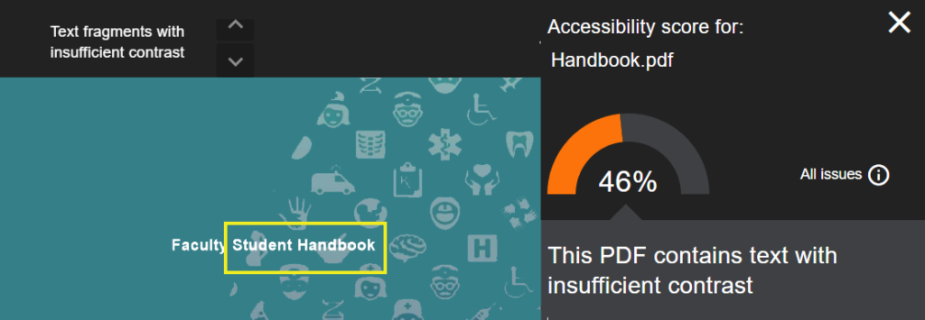
Ally shows reports for files that have text with insufficient contrast. The great thing is that Ally will highlight the text that is required to be changed.
Ally will tell you the number of issues relating to the text.
Use the up or down arrow to find the error information.

When creating documents consider your background image, this could be the reason for text having insufficient contrast.
Watch out for Microsoft table styles, you may need to change the background to something darker..

Text with a background colour
- Trying to emphasise text so users see what you are wanting to teach or converse, can sometimes compromise accessibility.
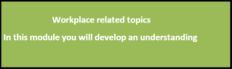
- The screenshot below shows white text on a green background which you would think, looks nice, breaks up the text, stands out.
- The background (#9BBB59) colour on the first text box combined with the white text (#ffffff) sits at a ratio of 2.17:1. which does not meet accessibility guidelines.
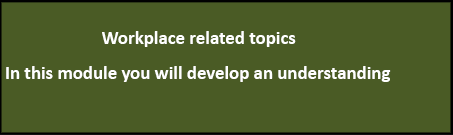
- The second image has a darker background of #4A5B25, which brings the text contrast up improving accessibility.
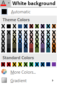
Text with a white background colour
For reference, if you are using a white background, the colours below not crossed out, within Microsoft Word pass the Contrast Ratio WCAG AAA for accessibility.
Images with contrast issues
Ally will often flag images with low contrast such as images containing text or screenshots.
It is often difficult to change the contrast issues with images i.e. screen shots, maps etc. but it is worth being aware of some of the issues so you can bare this in mind when creating accessible materials and choosing images.
Contrast issues in images fall in three brackets.
- Colour contrast of the image compared to the background.
- These need to have a contrast ratio of at least 3:1
- Colour contrast of words within the image to the background.
- These need to have a contrast ratio of at least 4.5:1
- Logos, brand names and images that are decorative
- These have no contrast requirements.
Colour contrast of words with an image in the background
Adding text to an image requires the contrast ratio to be at least 4.5:1.
Adding wording to this outlook icon, the contrast ratio is now 1.31:1, compared to the second which is 9.55.
Use WebAim accessibility checker to check colours, for image and text.


Colour contrast of the image to the background
The image content should be at least 3:1 in contrast to the background.
Adding a blue background to this outlook icon, the contrast ratio is now 1.22:1, compared to the original 4.61:1.
Use WebAim accessibility checker to check colours, for image and text.