Overview
This article explores the use of the following Navigation and Layout elements/functions in Xerte;
- Top Bar Navigation
- Left Menu Navigation
- Tabs
- Pills
- Accordion
- Carousel
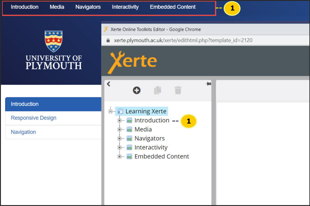
Top Bar Navigation
Each page within a Xerte project will show on the Top Bar Navigation.
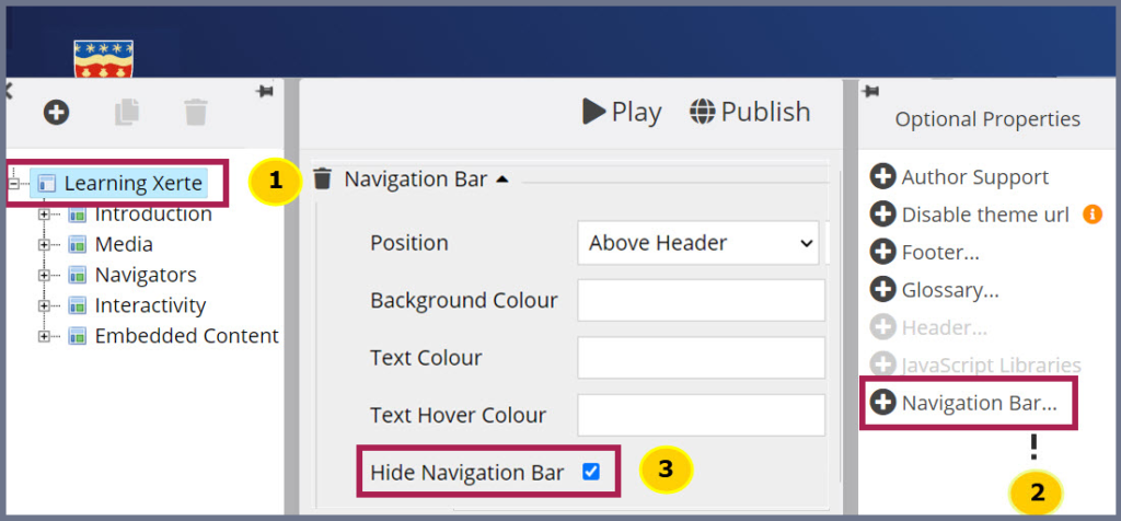
Removing -Top Bar Navigation
- Go to the Xerte main holding page
- Within ‘Optional Properties’, click Navigation Bar
- Click the checkbox – Hide Navigation Bar
Fixing the Top Navigation Bar to the Top of your Screen
Within Xerte, the Top Navigation Bar appears only at the top of the web page. This means that when you scroll down, the top menu will go out of sight. To amend this and have the top menu stay in view, you will need to add a CSS code.
To do this:
- Go to the Xerte main holding page
- On the right section click ‘Styles’
- Type in the following code
.navbar-fixed-top { /* position: fixed; */ position: sticky;}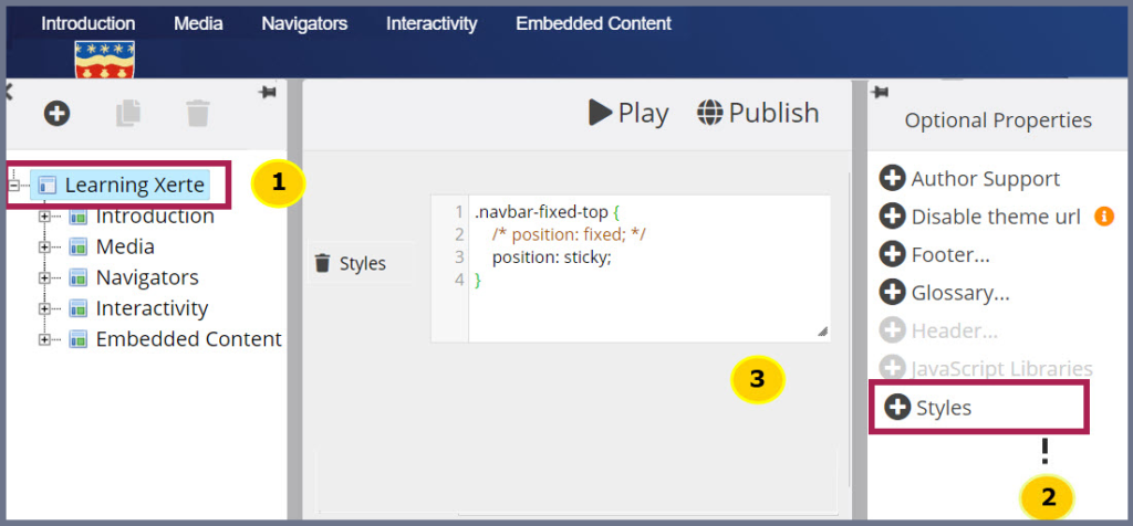
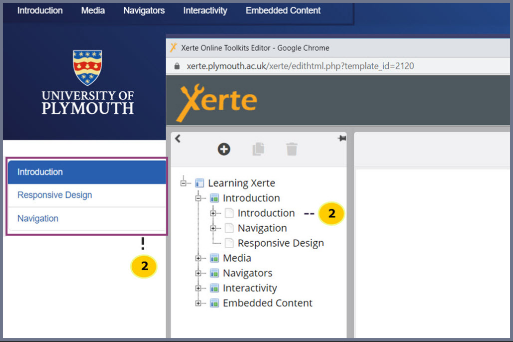
Left Menu Navigation
The Sections within Xerte will show on the left menu.
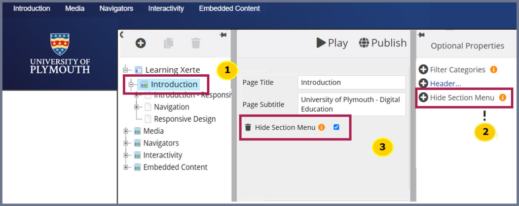
Removing – Left Menu Navigation
- Go to the Xerte section page
- On the right section, Click ‘Hide Section Menu’
- Click the checkbox – ‘Hide Section Menu’
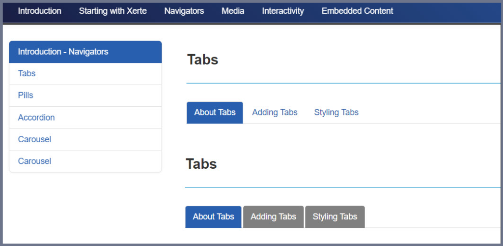
Tabs
Tabs allow you to:
- Meaningfully separate content into different sections.
- Show people what content is available to them and how they can get to that content.
Adding – Tabs
- Click page where the Tabs Navigation is required
- Click ‘New Navigation’
- Select Tabs from the drop-down Menu
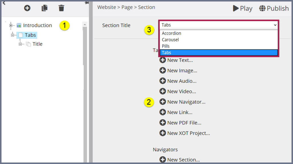
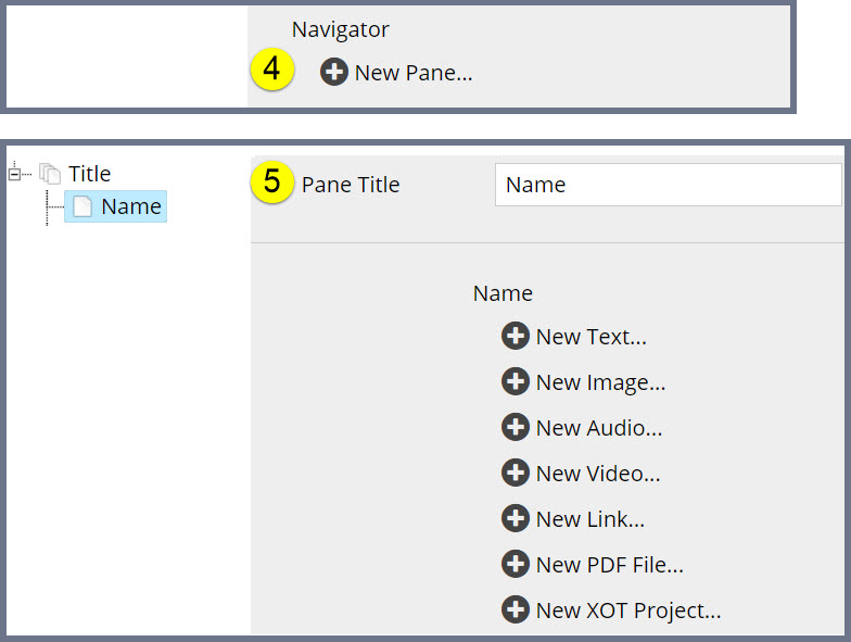
- Click ‘New Pane’
- Select the content media required

Styling – Tabs
Design Tip: Maintaining consistency throughout the resource will enable the user focus on the material. A mishmash of colors, different size text and fonts can confuse the user.
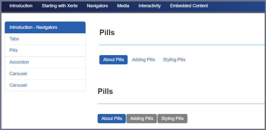
Pills
Just like Tabs, Pills allow you to:
- Meaningfully separate content into different sections
- Show people what content is available to them
- Can be used to show hyperlinks to other pages or websites
Adding – Pills
- Click page where the Pill Navigation is required
- Click ‘New Navigation’
- Select Pills from the drop-down Menu
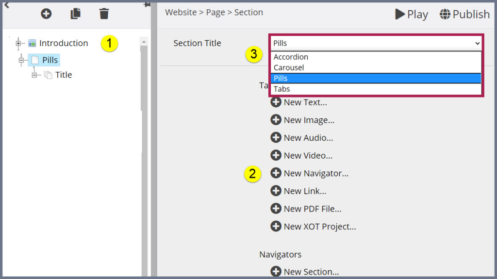
- Click New Pane
- Select the content media required

Styling – Pills
Design Tip: Maintaining consistency throughout the resource will enable the user focus on the material. A mishmash of colors, different size text and fonts can confuse the user.
Accordion
The Accordion is a great way to tidy a page up, preventing a heavy text-based resource from becoming cumbersome.
Adding – Accordion
- Click page where the Accordion Navigation is required
- Click ‘New Navigation’
- Select Accordion from the dropdown Menu
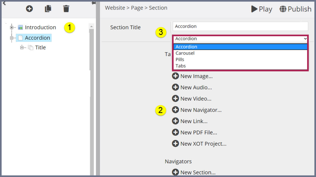
- Click ‘New Pane’
- Select the content media required

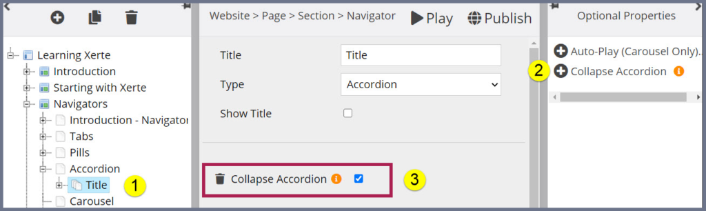
Collapse – Accordion
You will find that with accordion the first section automatically appears open, this can be changed in Xerte Bootstrap but not in the Toolkit.
Closing the first section
- Click the Accordion page.
- Within ‘Optional Properties’ add ‘Collapse Accordion’.
- ‘Collapse Accordion’ action will show under the title, tick the check box.
Styling – Accordion
Design Tip: Maintaining consistency throughout the resource will enable the user focus on the teaching resource. A mishmash of colors, different size text and fonts can confuse the user.
Carousel
The Carousel is another great way to tidy-up a page. it allows users to click right and left arrows to view panes, and is best for images.
Adding – Carousel
- Click page where the Accordion Navigation is required
- Click ‘New Navigation’
- Select Carousel from the dropdown Menu
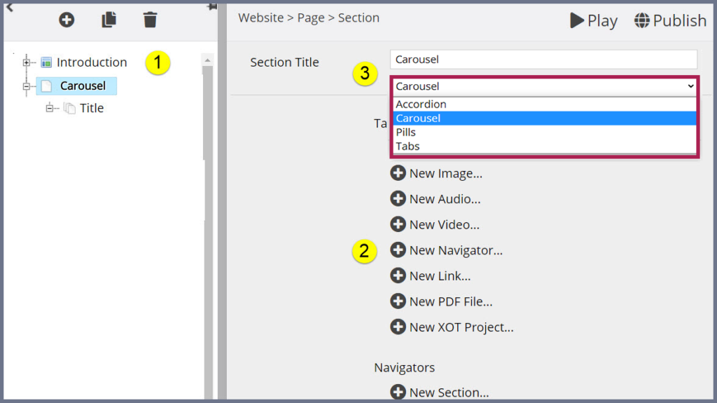
- Click ‘New Pane’
- Select the content media required
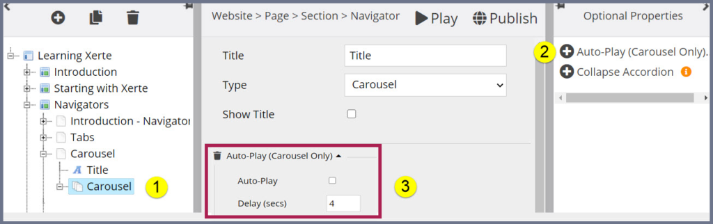
Auto-Play- Carousel
- Click the Carousel page.
- Within ‘Optional Properties’ add ‘Auto-Play’.
- ‘Auto-Play’ action will show under the title.
Styling – Accordion
Design Tip1: It is suggested that you keep a Carousel to images only, as text can be cut off.
Design Tip2: Keep the images the same size
User Experience – Accordion
User Experience 1:
Having a Carousel as navigation and having the Auto-Play on is not effective for addressing the needs of people with disability issues. The user losses some control of their own speed of learning if you do not turn it off.
User Experience 2:
It is suggested that you keep a Carousel to images only, as text can be cut off and try keep the images the same size.